Visual language elements: Top or Bottom


The meaning of these two elements of visual language largely corresponds to their spatial arrangement: top and below.
Image elements that we photographers place in the upper area of an image usually appear more important, loftier, stronger, or superior to the viewer. In contrast, elements in the lower area of the image are rather associated with inferiority, weakness, dependency, smallness, or lesser significance.
This effect is based on unconscious perceptual patterns and can be used purposefully to enhance the image message. This visual impact becomes particularly clear through the deliberate use of the portrait format. It emphasizes the vertical arrangement of the image elements and thus reinforces the perception of „top“ and „bottom“.
This principle is also evident in Annie Leibovitz's famous portrait of Elon Musk and his mother. His mother is positioned slightly higher in the frame—not by much, but it's clearly noticeable.
Furthermore, Annie Leibovitz uses another element of visual language here. The viewer's gaze often wanders first to the brightest areas of the image. Since Musk's mother is wearing a white blouse and is set against a dark green background, the viewer's gaze is drawn to her first—and not to the billionaire.
In addition, it is located almost in the center of the image – another design element that draws the viewer's attention.
To me, this picture demonstrates very impressively how multiple elements of visual language can be used simultaneously. It is therefore no coincidence that Annie Leibovitz is among the best-known and most sought-after photographers in the world. Ultimately, it does not play a decisive role whether she chose this compositional style consciously or intuitively. The effect of the visual language also unfolds largely unconsciously in the viewer.
Visual Language: From Left to Right
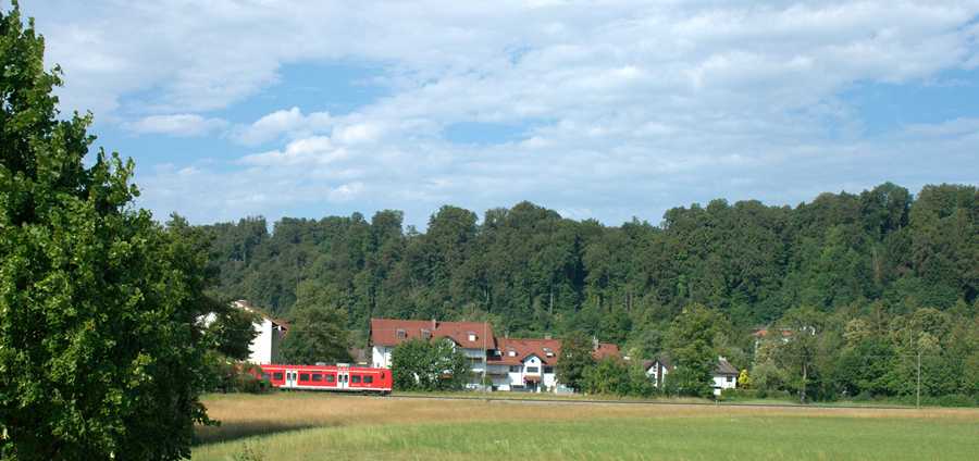
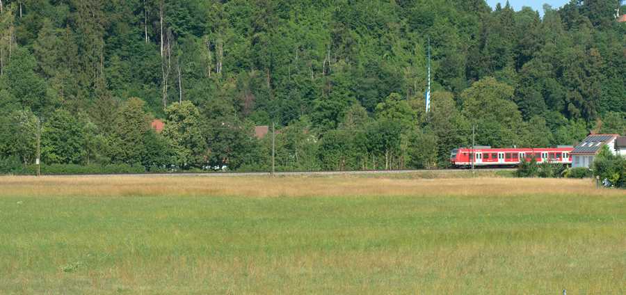
Normally, in Western culture, we read and write from left to right.
Arriving in the middle of a sentence, the beginning of the sentence already lies to the left in the past, while the rest of the sentence still lies to the right in the future. This familiar reading direction also influences our visual perception. As photographers, we can therefore use it specifically as an element of visual language.
Therefore, it is obvious to consider the S-Bahn in the upper picture as moving into the frame to perceive. The S-Bahn in the right-hand image, by contrast, looks as if it is already leaving the frame again. The direction of movement from left to right supports this impression and gives the image a different effect – even though the two photos differ only in their orientation.
Visual imagery: Lonely and alone

It is often said that one alone can be without itself lonely to feel – and conversely, can feel deeply lonely in the middle of a crowd. Although both terms are often mentioned in the same breath, they describe completely different states.
- Alone Describes an external state: being without other people. This does not have to be either good or bad.
- Lonely Describes an inner feeling: One feels abandoned, isolated, or wishes for more closeness and contact.
- You can be alone without being lonely, for example when you enjoy peace and quiet or consciously take time for yourself.
However, both states describe strong emotional states, and both are human: Both the need for withdrawal (solitude) and the feeling of loneliness (as a signal that we lack social contact) are completely normal, human experiences.
Being alone is a superpower: It helps us find ourselves, be creative, and recharge our batteries.
Loneliness is a warning signal: It functions like hunger or thirst – it shows us that we are lacking something vital to life: real, deep connection to others.
Visual language: Ascending, positive

I had already tried my hand at this topic a long time ago, but then gave up discouraged. Even in his book „The Language of Photography,“ Ted Forbes doesn't go beyond general considerations: lines, shapes, colors, rule of thirds, golden ratio, composition, etc.
These general topics are in every photography textbook. And true to the motto, „The books I read, I write myself,“ I am still firmly convinced that this could make an interesting book.
So an element of visual language that we photographers can use to express something in terms of visual communication is ascending or descending lines.
And as is often the case, these elements of visual language are certainly culturally shaped and do NOT apply to all people worldwide in the same way.
Imagery: descending, negative

- Ascending lines symbolize upswing, growth, strength, optimism.
- Descending lines indicate loss, end, downturn,
This applies at least to all image viewers here in Germany, Europe, and the Western world. Everyone prefers rising stock prices to falling ones. Motifs with rising lines can be found everywhere, right on your doorstep. No long-distance travel is necessary for this.
Visual language: Upward, optimistic

I strongly believe in the elements of successful visual language, even if this seemingly is just about geometry. I believe that lines pointing from bottom left to top right within the image express an ascending, positive, optimistic state of affairs.
Yet somehow, the withered, dead, dying leaf does not fit this positive statement.
Imagery: Downward, decline

So I photographed the same subject again from a different camera position.
Yes, I know that imagery cannot always and exclusively be reduced to geometry. But sometimes it fits together.
Visual language: Growth

We humans know that exponential growth cannot occur in nature. But every one of us, even if they only own a single share of stock, secretly hopes and dreams for it.
Visual language: Growth goes from bottom left to top right. An optimistic sign, an optimistic visual message. If you don't believe it, read on:
Imagery: Decline

The same image as above, only vertically mirrored. The trend is clearly pointing downwards. (Geometry in visual language yet again).
Imagery is important. Even when the subject is not the main subject, like here. Even if something in the background points downwards, it triggers this reaction in the viewer.
By the way: A well-known politician was dismissed today. The accompanying picture: He is walking down a staircase from top left to bottom right. The staircase railing also goes from top left to bottom right.
Mirror images

In photography, reflections in lakes or calm rivers have a strong artistic and symbolic statement. They convey specific moods and messages:
- Symmetry and Harmony: A perfectly smooth water surface creates a natural reflection that leads to strong symmetry in the image. Symmetry has the statementPeace, balance, order and pure harmony. .
- Visual depth and spatial awareness: The reflection „doubles“ the subject. This creates a fascinating optical depth that draws the viewer deeper into the image and makes the space appear much larger or more powerful than it actually is.
- Peace, quiet and meditation: Lakes and calm rivers without waves evoke a sense of complete relaxation, peace, and solitude. The photo invites you to pause and let the moment sink in.
- Two worlds (reality and illusion): A reflection blurs the line between up and down, between reality and the world of dreams. The reflected image often seems like a mysterious parallel dimension.
Fifty-fifty: or indecision

Generally speaking, these halved images are said to show that the photographer couldn't or wouldn't quite decide what they actually wanted to show: Is it the nice weather, the green color of the Loisach, or the Sebastiani Bridge in the middle? As it is now, the image expresses all three aspects, but none really dominantly. And how is the viewer supposed to notice what is really important, what the photographer wanted to show, if the creator of the image themselves cannot make up their mind.
The sky – the weather

Here the statement is clear: nice weather, blue sky, calm midsummer weather, and as context: the Sebastianisteg bridge over the Loisach in Wolfratshausen. Because the sky takes up the largest area of the image and carries the most weight, the viewer's gaze is clearly guided. It is like an exclamation mark at the end of a sentence:
I was in Wolfratshausen yesterday and the weather was perfect!!!!
Or: Look here, I brought this picture with me!!!
The foreground

Here, too, the message of the image is clear: the calm, smooth surface of the Loisach and, as context, the Sebastianisteg footbridge in Wolfratshausen. And the green color of the Loisach is particularly emphasized simply by the fact that the green Loisach takes up most of the space in the image.
No ships, no oily film on the water, no waves, no concrete banks, no commotion. Must be a small, quiet place, this Wolfratshausen.
By the way: The experienced picture viewer immediately and consciously notices that vertical format shots were taken here to illustrate the topic of image area weighting.
Image composition in landscape format
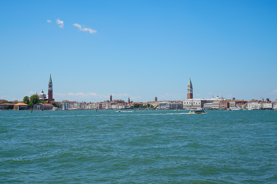
Unfortunately, this image also lacks a clear message or speaks a clear language: blue sky, blue sea, and wedged in between: the skyline of Venice. The viewer asks themselves: what is important, what should I pay attention to, or is it a picture puzzle where I should memorize everything as precisely as possible. That is annoying and causes stress.
The sky
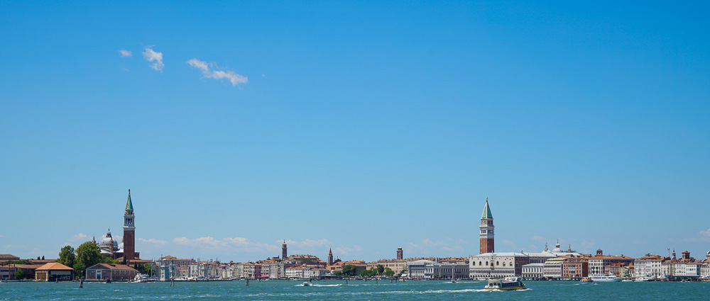
Now it is clear: fine weather over Venice. No wonder: Venice is located right in the middle of a summer holiday region where millions of vacationers spend their summer every year. Only a single lonely fair-weather cloud lightens up the sky a bit as an eye-catcher.
Insellage
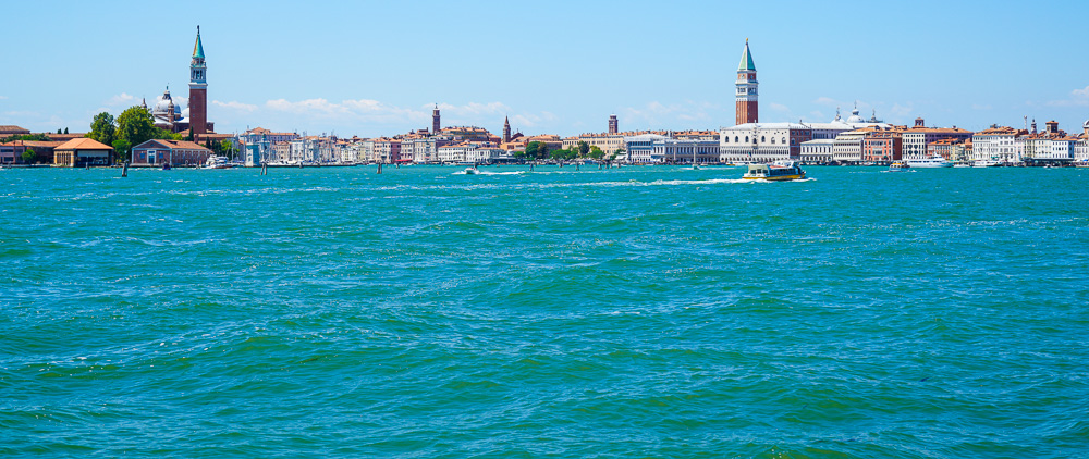
Still clear: Venice is an island located in the middle of the northern Adriatic Sea. You can only get to Venice by ship. By focusing on the essentials, an image gains extreme expressiveness.
The usual photographer behavior
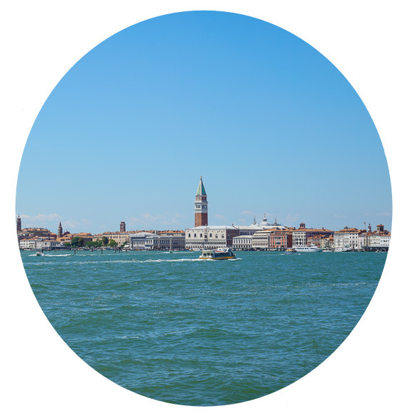
You see this kind of centered photo everywhere. In the age of mobile photography, with a global maximum of 8 billion cameras (called cell phones) and the fact that it is ridiculously easy to take a photo by touching a display, it is, thank God, also used abundantly. And please: Everyone should, can, and will do what they think is right. Even if photographers are of a different opinion.
Our daily viewing experience is always centered. Wherever our eye looks is always the center: with a horizontal field of view of about 180 to 200 degrees to the left and right (always assuming we do not move our head) and a vertical field of view of about 60 to 75 degrees upwards or downwards.
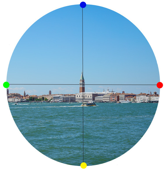
There is no other way. When we realign our head or eyes and look elsewhere, the new image appears centered again. We always see centrally. And consequently, the vast majority of people also take centered photos simply because they are used to it.
Only in a photograph can we look to the left at the green dot or to the right at the red dot. Or look up at the blue dot or down at the yellow dot. In reality, we shift our entire field of vision to the new center point. There, and only there, does our eye see sharply. Therefore, we have no choice other than to always look into the world centered (in sharp focus). If we extend our arm and hold our thumb up, the sharpness that we see is roughly only as large as a thumbnail. And without us noticing, our eye darts lightning-fast to several important objects, focuses sharply there, and leaves it to the brain to generate a sharp overall image.
Lines
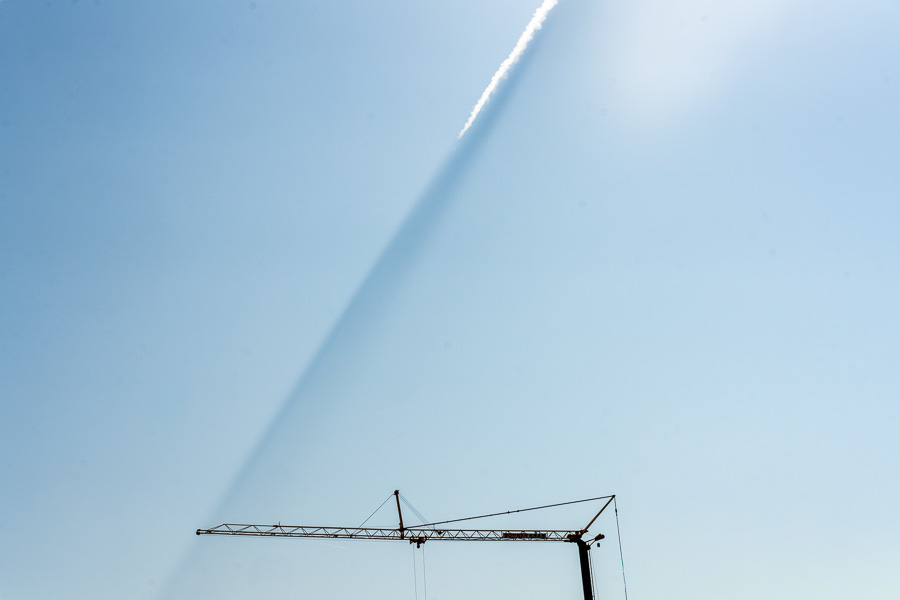
Basically, there are only 3 types of lines. Horizontal, vertical, or diagonal lines. Each type has its own individual message.
Horizontal lines
These lines are unspectacular. And therefore reassuring. We see them daily. By the sea, on the horizon, roads and sidewalks are horizontal. The floor beneath us, we mostly stand and walk on horizontal lines. They are familiar to us. Safe. Ordinary.
Vertical lines
They indicate height. For example, I have a fear of heights. For me, danger looms in anything higher than a meter. Energy is required to create height and maintain it over time. A tree, a house, a mountain, etc. Unlike horizontal lines, height is not a natural state. Over the course of millions or billions years, every height becomes horizontal. And extreme vertical lines such as skyscrapers or towers are admired because they actively defy gravity, but they are also potentially threatening.
Diagonal lines
Here we must strictly differentiate between ascending and descending diagonal lines.
Rising lines bear witness to positive momentum, an upswing, growth, optimism, strength, etc.
Descending lines stand for decline, end, downturn, weakness,