The visual language element: Frame
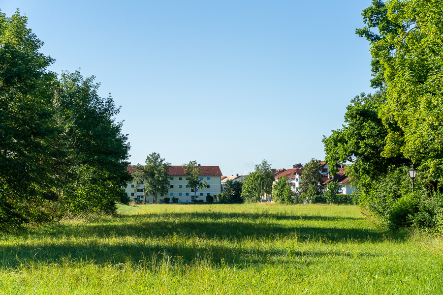
Framing, in German Frame, is one of the classic composition techniques in photography and is covered in practically every photography textbook. For me, it is much more than just a rule of composition – it is an important element of visual language.
Links: The viewer's gaze wanders to the left and encounters the edge of the forest. It intuitively becomes clear: there is nothing more to discover here. A wider section of the image would merely show more trees – without any additional image content.
Right: The same applies to the right side. Here too, the trees form a natural border for the image. Expanding the frame further to the right would not enrich the image.
Above: The upper edge of the image is defined by the blue sky. Here too, the impression arises that more sky would not add any value. A portrait format would therefore be the significantly weaker choice.
Below: It is the same at the bottom of the image. The meadow fulfills its function as the border of the image. More of it would not strengthen the message of the photo.
Thus, all four edges of the image guide the viewer's gaze toward the center of the image. The houses are located there – the actual subject. The framing ensures that the gaze does not wander out of the image, but is repeatedly led back to the center.
Admittedly: The houses don't exactly knock a Wolfratshauser off their feet. Anyone who lives here sees such motifs every day. But that is precisely not what this example is about for me.
For me, the decisive realization is how effectively framing can steer the perception of an image. Consciously recognizing this design tool and using it purposefully is an important step for me on the way to a stronger visual language. When the truly interesting subjects are then in front of the camera, I want to be able to use this tool quite naturally.
Visual language elements: Top or Bottom
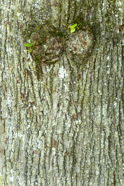
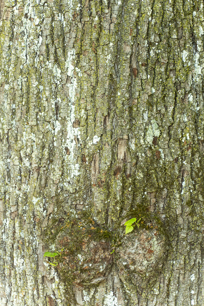
The meaning of these two elements of visual language largely corresponds to their spatial arrangement: top and below.
Image elements that we photographers place in the upper area of an image usually appear more important, loftier, stronger, or superior to the viewer. In contrast, elements in the lower area of the image are rather associated with inferiority, weakness, dependency, smallness, or lesser significance.
This effect is based on unconscious perceptual patterns and can be used purposefully to enhance the image message. This visual impact becomes particularly clear through the deliberate use of the portrait format. It emphasizes the vertical arrangement of the image elements and thus reinforces the perception of „top“ and „bottom“.
This principle is also evident in Annie Leibovitz's famous portrait of Elon Musk and his mother. His mother is positioned slightly higher in the frame—not by much, but it's clearly noticeable.
Furthermore, Annie Leibovitz uses another element of visual language here. The viewer's gaze often wanders first to the brightest areas of the image. Since Musk's mother is wearing a white blouse and is set against a dark green background, the viewer's gaze is drawn to her first—and not to the billionaire.
In addition, it is located almost in the center of the image – another design element that draws the viewer's attention.
To me, this picture demonstrates very impressively how multiple elements of visual language can be used simultaneously. It is therefore no coincidence that Annie Leibovitz is among the best-known and most sought-after photographers in the world. Ultimately, it does not play a decisive role whether she chose this compositional style consciously or intuitively. The effect of the visual language also unfolds largely unconsciously in the viewer.
Visual Language: From Left to Right
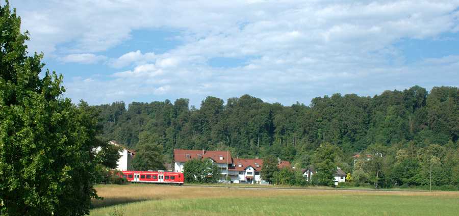
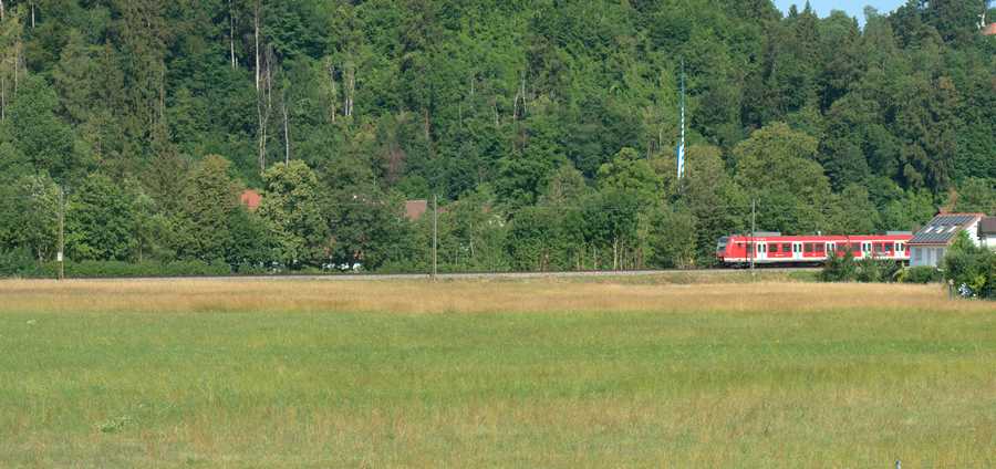
Normally in Western culture, we read and write from left to right.
Arriving in the middle of a sentence, the beginning of the sentence already lies in the past, while the rest of the sentence still lies in the future. This familiar reading direction also influences our perception of images. As photographers, we can therefore use it deliberately as an element of visual language.
Therefore, it is obvious to consider the S-Bahn in the upper picture as moving into the frame to perceive. The S-Bahn in the right-hand image, by contrast, looks as if it is already leaving the frame again. The direction of movement from left to right supports this impression and gives the image a different effect – even though the two photos differ only in their orientation.
Visual imagery: Lonely and alone
It is often said that one alone can be without itself lonely to feel – and conversely, can feel deeply lonely in the middle of a crowd. Although both terms are often mentioned in the same breath, they describe completely different states.
- Alone Describes an external state: being without other people. This does not have to be either good or bad.
- Lonely Describes an inner feeling: One feels abandoned, isolated, or wishes for more closeness and contact.
- You can be alone without being lonely, for example when you enjoy peace and quiet or consciously take time for yourself.
However, both states describe strong emotional states, and both are human: Both the need for withdrawal (solitude) and the feeling of loneliness (as a signal that we lack social contact) are completely normal, human experiences.
Being alone is a superpower: It helps us find ourselves, be creative, and recharge our batteries.
Loneliness is a warning signal: It functions like hunger or thirst – it shows us that we are lacking something vital to life: real, deep connection to others.
Imagery: Life

Life is possible everywhere. Even if, like here, it is only possible for a short time. No matter how long a life lasts, wherever the opportunity presents itself, it is seized.
- Life does not hesitate long.
- Life does not think long: Shall I or shall I not?
- Life does not endlessly weigh risks and opportunities against each other.
- Life takes advantage of even the smallest chance.
- Life is strong.
Images that show life stand for Strength, power, courage, endurance, energy, optimism. Whoever wants to express these attributes in their pictures shows life.
Visual language: Death

The same motif, just a few days later. Out like a light, that's it, over. But upright until death: Full of pride: At least I tried. I lived.
Or as the saying goes: Losers find excuses, winners find solutions.
Imagery of death: This too is part of it: death, end, decline, transience. At least as a reminder to the living: Use your time, you never know how long you will be here.
Imagery of death: A strong expression. A strong statement.
Contradictory visual communication

Death imagery again. But contradictory in visual communication.
In death, one is usually no longer upright. And the sun does not shine in a life-affirming way. The color contrast is fine. Green harmonizes with brown. But death is not a harmonious event or motif.
This is comparable to when we are talking in daily life (verbal communication) and explicitly deny a certain topic, but irritatingly nod our heads along with it, meaning we send out affirming signals. Or we affirm a topic and always shake our heads while doing so. Communication can also be confusing.
Verbal communication: Talking over each other
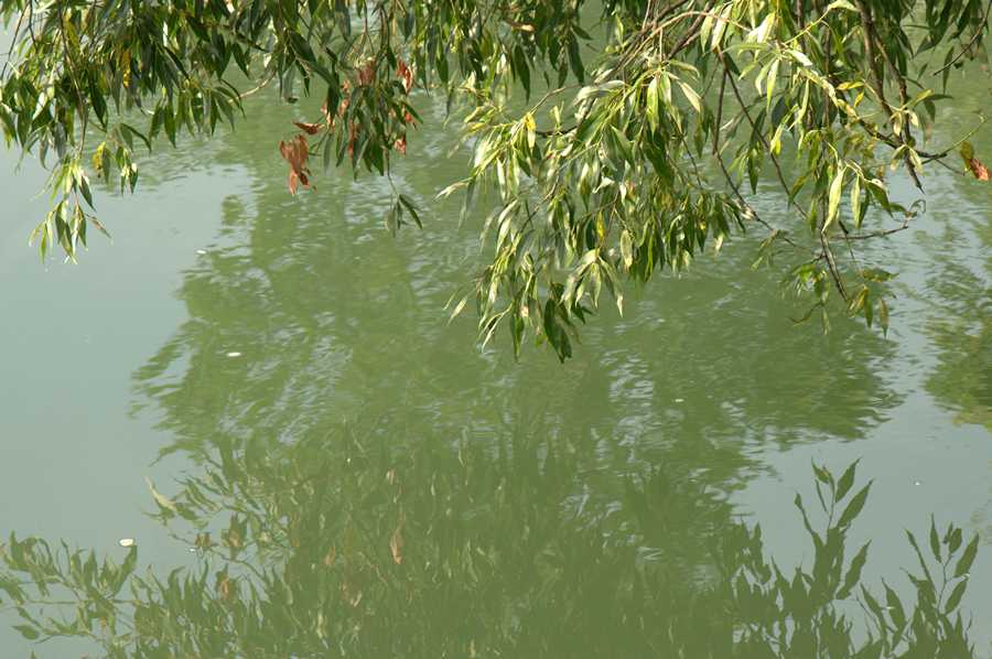
We all know the situation when we want to converse with other people in a crowded restaurant or a beer tent. Hardly possible. Everyone is talking at once, and the background noise is difficult to drown out. We can all sing together, but not talk together. We can only combat this with great, exhausting volume.
We photographers can also make this communication mistake. Experts know: the background is just as important as the subject.
Visual Communication: Background
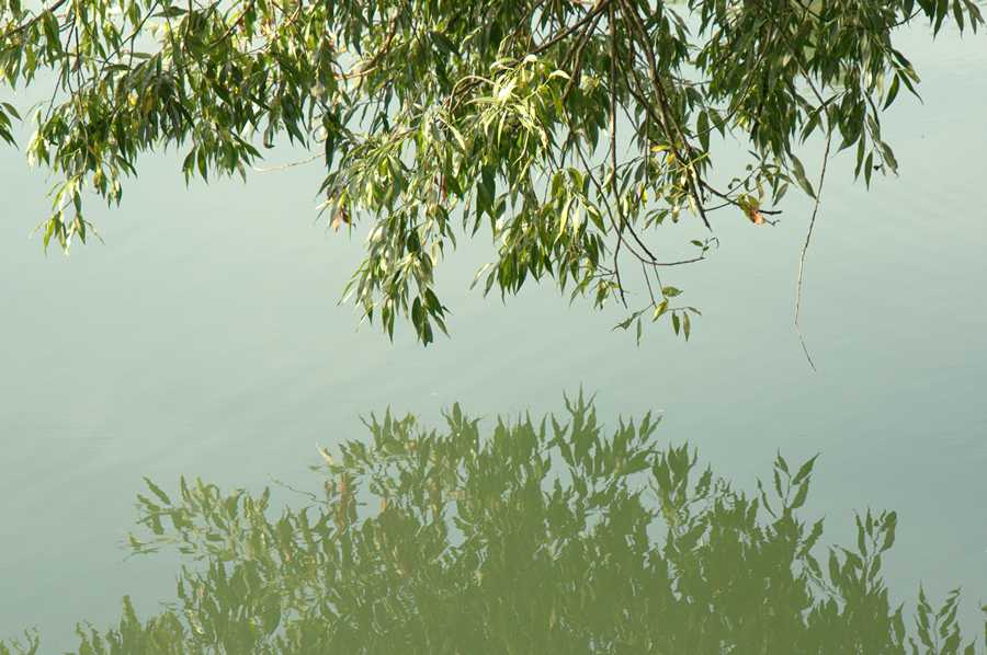
Just take 2 meters to the left and everything becomes clear. The background no longer obscures the subject. The image has a clear, understandable message.
Every photography textbook contains the statement: Our legs are better than any zoom lens.
Visual language: Ascending, positive
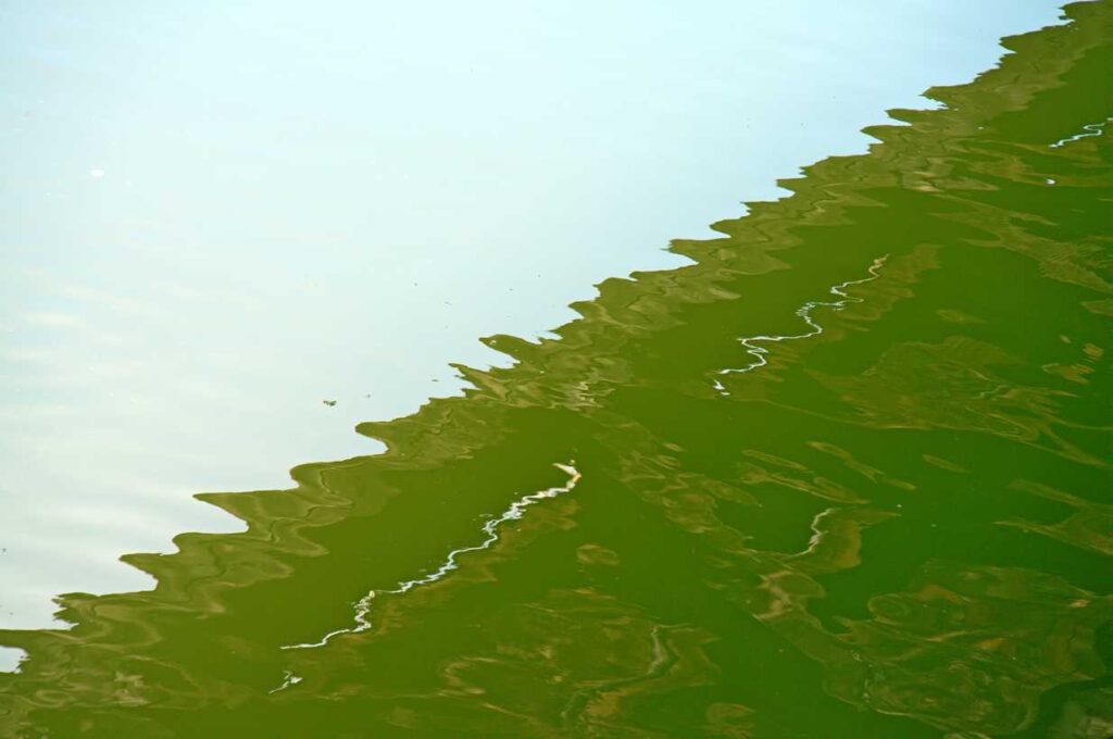
I had already tried my hand at this topic a long time ago, but then gave up discouraged. Even in his book „The Language of Photography,“ Ted Forbes doesn't go beyond general considerations: lines, shapes, colors, rule of thirds, golden ratio, composition, etc.
These general topics are in every photography textbook. And true to the motto, „The books I read, I write myself,“ I am still firmly convinced that this could make an interesting book.
So an element of visual language that we photographers can use to express something in terms of visual communication is ascending or descending lines.
And as is often the case, these elements of visual language are certainly culturally shaped and do NOT apply to all people worldwide in the same way.
Imagery: descending, negative
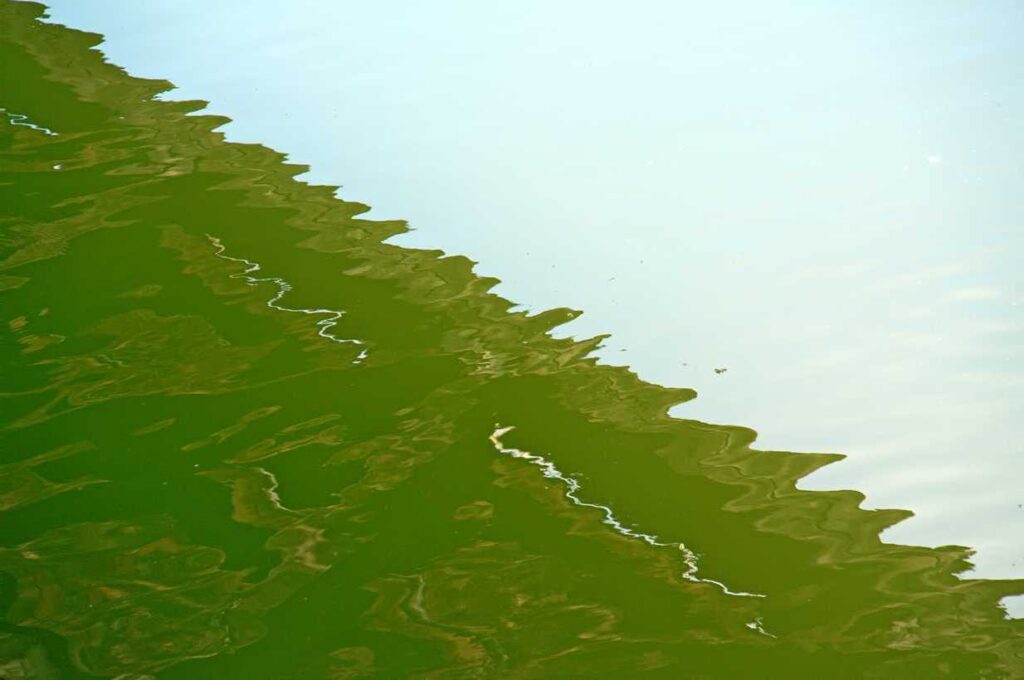
- Ascending lines symbolize upswing, growth, strength, optimism.
- Descending lines indicate loss, end, downturn,
This applies at least to all image viewers here in Germany, Europe, and the Western world. Everyone prefers rising stock prices to falling ones. Motifs with rising lines can be found everywhere, right on your doorstep. No long-distance travel is necessary for this.
Visual language: Upward, optimistic
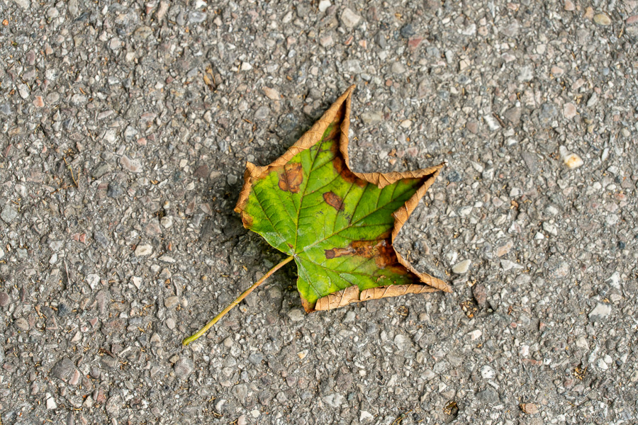
I strongly believe in the elements of successful visual language, even if this seemingly is just about geometry. I believe that lines pointing from bottom left to top right within the image express an ascending, positive, optimistic state of affairs.
Yet somehow, the withered, dead, dying leaf does not fit this positive statement.
Imagery: Downward, decline
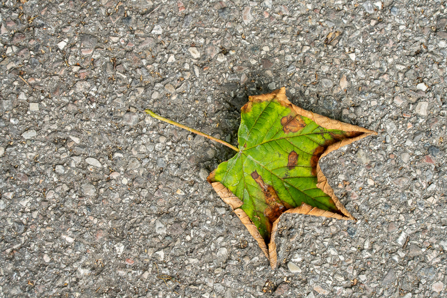
So I photographed the same subject again from a different camera position.
Yes, I know that imagery cannot always and exclusively be reduced to geometry. But sometimes it fits together.
Visual language: Growth

We humans know that exponential growth cannot occur in nature. But every one of us, even if they only own a single share of stock, secretly hopes and dreams for it.
Visual language: Growth goes from bottom left to top right. An optimistic sign, an optimistic visual message. If you don't believe it, read on:
Imagery: Decline

The same image as above, only vertically mirrored. The trend is clearly pointing downwards. (Geometry in visual language yet again).
Imagery is important. Even when the subject is not the main subject, like here. Even if something in the background points downwards, it triggers this reaction in the viewer.
By the way: A well-known politician was dismissed today. The accompanying picture: He is walking down a staircase from top left to bottom right. The staircase railing also goes from top left to bottom right.
Retail space for rent in Wolfratshausen:
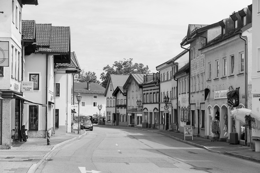
This picture also has a message. Of course.
Imagine you own a property right in the heart of Wolfratshausen's old town.
And since the previous tenant is giving up their business due to old age, you are looking for a new tenant. And in your ad, you are showing the location of the property with a (with this) picture.
Would you really use this picture with that caption? A picture that depicts tranquility, solitude, serenity, and the good old days—a picture that suggests: there’s nothing, absolutely nothing going on here? An image that makes every viewer intuitively wonder: Were there even cars back in 1926, and where did all the horse manure on the street go?
The new potential tenant realizes immediately: no people, no customers, no purchasing power, no business, no profit, nothing going on!! So, no thanks!
Mausetotredner
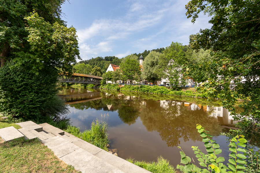
The Bavarian folk actor Peter Steiner use this word: „MausTotRedner“ as a typically Bavarian, onomatopoeic word creation: A „Maustotredner“ is an onomatopoeic compound consisting of the word spices and Speaker:
Meaning: One windbag or a „windbag“, who talks for so long, monotonously and continuously, until his listeners „spices“ (so completely exhausted, bored, or speechless). What is meant is simply someone, who literally „talks you to death“ with his endless monologues“.
We photographers also master this verbal misconduct with our visual language: when our visual communication shows the viewer far too much, they no longer recognize the essential, the core of a photographic message at all.
When we force as much as possible into the frame with a wide-angle lens, meaning we „talk too much,“ the important things unfortunately get lost in the „endless“ stream of words. The same applies when we show far too many images in a series. Then, in the spirit of Peter Steiner: „Picture dead hit“
Many photography textbooks explain that painters and photographers both create images, but the way they get there is completely different. Painters use the additive art. You typically start with a blank white sheet of paper and then (additively) add dots, lines, areas, blobs, and individual parts until your picture is finished.
We photographers use the subtractive method. When composing our images, we focus on the essentials—on what we individually want to express—and position the camera and angle our view so that unimportant and distracting elements are not included in the picture.
Actually, that speaks in favor of using a tripod so that we can calmly compose the image on the display or in the viewfinder right there on location just the way we envision it.
After all, a painter isn't finished with their painting in a thousandth of a second either. And we photographers should also take the time, peace, and care to make our art as perfect as possible. Even if we photograph the same subject 2 or 3 or 100 times until the lighting is just right for us. But that takes passion, like Jonathan Livingston Seagull.
„Foreground makes the picture good“
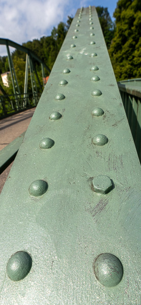
A quote that probably every photographer has heard many times. Which they acknowledge, use, and unfortunately also abuse often enough.
The image shown here is better in its message than showing the entire bridge railing with all the rivets using a drone. Because with a wide shot, all the rivets would be equally small and thus equally difficult to see.
Typical use case: The lower half of the image shows a mountain stream with large, round, smooth stones, and the water splashing around the stones as it foams wildly.
Around the rest of the image, getting smaller and smaller, the statement: As shown in detail at the bottom of the image, it goes hundreds of meters up the mountain here, or from the water's perspective: down.
This shows the viewer extremely clearly what reality looks like. A clear message that everyone immediately understands. Better than photographing all the stones the same size.
Image depth
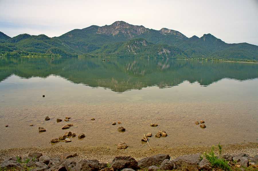
The previous approach, in the sense of the preceding image, would be: Look here, dear viewer, as rocky as the foreground shows it here, it continues throughout the rest of the image. The lake is full of rocks and the mountains in the background as well. Unfortunately, that is not the case.
Literature often recommends emphasizing the foreground with a wide-angle lens, centering on the theme of image depth. The underlying idea: The reality in which we move every day and which we see and photograph is always three-dimensional. But the image on a sensor or slide is only two-dimensional. Therefore, we must help the viewer perceive the image with its three dimensions as well.
The foreground only serves to detect the image depth. Andreas Feininger shows many examples of how an image gains depth. However, image depth only serves as another element of visual language. And if an image does not explicitly have depth as its statement, it confuses the viewer.
And many photography textbooks claim: based on their life experience, every person automatically recognizes the depth and three-dimensionality of a photograph. An image with the depth elements taught by Andreas Feininger can at most support this a little. Provided it serves the composition's statement.
Depth
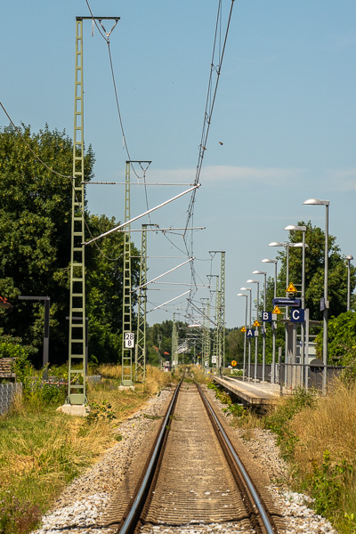
Yes, this image has depth. But nothing more than that. This image magnetically draws the viewer to the end of the tracks. And what does he see there then: Nothing. And then he feels rightly taken for a ride. Maybe he'll take a second, closer look.
We know this from daily life. There, too, we are verbally confronted with false promises.
Who still knows which politician said this sentence:.
„You cannot rely on what is said before the elections actually applying after the elections. And we must expect that this can repeat itself in various ways.“
Exclamation mark
We all know them, the words or sentences with an exclamation mark at the end. In speech, too, important points are emphasized in particular.
This stylistic device is also available to us photographers when we want to emphasize something very special, when we want to rub the viewer's nose right in it.

One possibility is the bokeh. The subject is in sharp focus against an out-of-focus, blurred background. These photos draw the viewer's attention to the object that we intentionally want to show them. They also have no other choice.
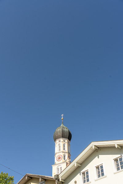
Another way to control attention is through the generous use of negative space. Since there is little of interest for the viewer to see in this image, their gaze is automatically directed to this small, lower part. We photographers are therefore certain that they will actually look at the part of the image we want to show and that the viewer is intended to perceive in particular.
Question mark
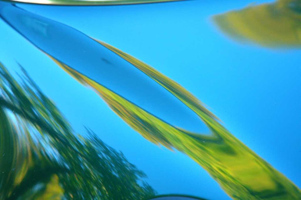
One of my favorite authors is William Neil. In his book, „The Essence of Photography,“ he writes: »I'd rather make a picture that asks a question than one that answers one.«
We humans love puzzles. To a certain degree, we love the challenge, the thrill of solving something complicated. Figuring out how something is. Overcoming a hurdle. Happiness researchers even believe: „Happiness is a bonus for overcoming things.“ Without this interest in puzzles, there would be no detective stories, no novels. Whether as a book, a television movie, or in the cinema. And many scientists have even turned this curiosity into their profession.
In my opinion, however, the puzzle must not be unsolvable. If the task is too difficult and no solution is in sight, we quickly lose patience.
It is part of human language that we utter question words and interrogative sentences. We also find many question marks in literature. Therefore, it is only logical and consistent that we photographers also make images that trigger a question in the viewer. Puzzles make our pictures exciting.
In the picture, the light reflections on the hood of a car.
Mirror images
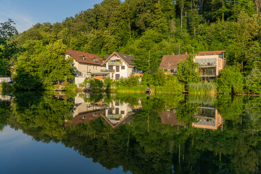
For years, I have loved photographing reflections. I find them almost daily in the immediate vicinity of where I live. Until now, it was a mystery to me why, on my daily photographic excursions, I keep bringing home so many reflections over and over again.
Subjectively, I feel that I've had a restless professional life. And that is why, as a hobby photographer, I have been clear from the very beginning that I particularly love „images of tranquility.“ Until it dawned on me while writing this text about reflections: especially the rare and nearly perfect reflections, when neither wind nor duck disturbs the water's surface, express a very special kind of tranquility.
In photography, reflections in lakes or calm rivers have a strong artistic and symbolic statement. They convey specific moods and messages:
- Symmetry and Harmony: A perfectly smooth water surface creates a natural reflection that leads to strong symmetry in the image. Symmetry has the statementPeace, balance, order and pure harmony. .
- Visual depth and spatial awareness: The reflection „doubles“ the subject. This creates a fascinating optical depth that draws the viewer deeper into the image and makes the space appear much larger or more powerful than it actually is.
- Peace, quiet and meditation: Lakes and calm rivers without waves evoke a sense of complete relaxation, peace, and solitude. The photo invites you to pause and let the moment sink in.
- Two worlds (reality and illusion): A reflection blurs the line between up and down, between reality and the world of dreams. The reflected image often seems like a mysterious parallel dimension.
Shadow
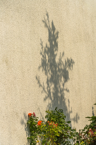
In photography, shadow images (also silhouettes) are far more than just the absence of light. They are a powerful creative tool that has its own artistic language speaks.
What do shadows mean from an artistic perspective?
- Reduction to the essentials: By making details, colors, and textures disappear in the dark, the subject is reduced to its pure form and outline. This forces the viewer to concentrate on the essentials – usually the body language, gestures, or the iconic shape of an object.
- Mystery and anonymity: Shadows veil identity. A silhouette of a human is universal and can often stand in for anyone. This creates a certain anonymity, but also a strong sense of mystery, enigma, and suspense.
- Dramaturgy and Emotion: Hard light and deep shadows (in photography often as High Contrast or Chiaroscuro referred to as) immediately create a dramatic, emotional atmosphere. They can convey melancholy, loneliness, but also threat or pure elegance.
- The interplay of light and darkness: Artistically speaking, the shadow does not exist without the light. It emphasizes the brightness and gives the image a three-dimensional effect and depth.
Word, sentence, and sentences
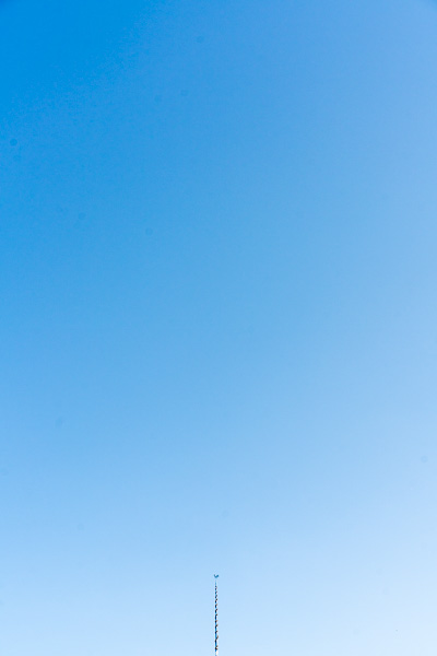
In our language, a sentence rarely consists of a single word.
When we want to warn someone, we shout STOP!
Even the word no already counts as a complete, full sentence.
However, those are exceptions. To be properly understood, we formulate a sentence with several words, and often we even speak or write multiple sentences. It is the same for us photographers: in almost all images there are multiple statements, and in exhibitions we often exhibit multiple pictures.
In this example image, the viewer also recognizes several elements of visual language:
- Plenty of sky showing the color blue,
- a maypole that can only be seen very small at the bottom edge of the image,
- Centered subject.
The meaning:
- The color blue has a specific effect on us humans.
- Motifs that are only indicated very small in the image are considered unimportant.
- A lot of negative space forces the viewer to look down.
- Centered parts of the image radiate calm. Symmetry and harmony.
For a photographer, this image naturally raises a lot of questions:
- Why is the Maypole so small?
- Why is he at the bottom of the image when in reality he is so big and towers high up into the sky above us?
- Why isn't the photographer using Rule of thirds – That's a must for good pictures!
- and where is the the Golden ratio, the „divine division“?
Sculptor, metal artist, or art blacksmith?
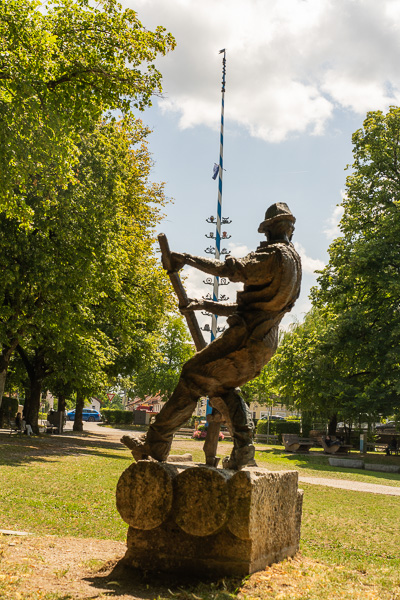
Visual language is not an exclusive means of expression for us photographers. Rather, my impression is that it is very rare for photographers to even think about the topic of visual communication in their images. At any rate, they never talk about it. As long as the lighting is right, you can safely press the shutter.
This monument is located in Wolfratshausen in the Maypole region. The artist, it was supposedly Jürgen Batscheider who designed and manufactured it together with a locksmith, wants to express something with it, make a statement.
The rafter's pose, with the typical posture used for steering, creates the impression of power, strength, dedication, and effort, and seemingly defies the laws of gravity. To emphasize this, I captured the strongly backward-leaning figure with the vertical maypole in the background.
The figure vividly presents the original movements and the hard everyday work of the rafters as a formal language.
Context
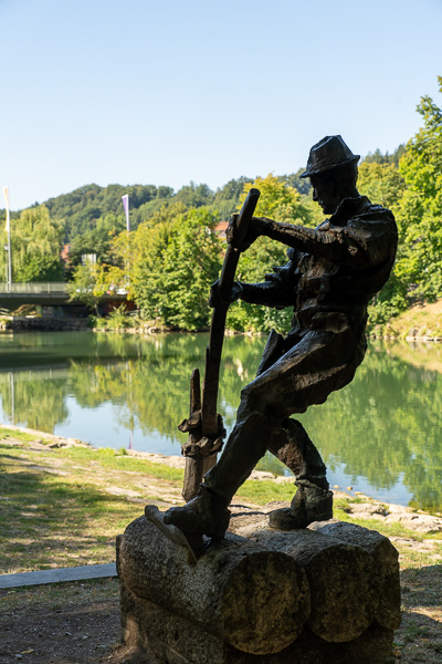
The location where this sculpture was erected was also chosen deliberately. Since it depicts a Loisach raft figure, it is naturally placed right next to the Loisach.
If this figure were standing at the entrance of the city hall, every visitor would certainly get the idea that all municipal employees also work just as hard, bent, and hunchbacked to provide the citizens of this city with the best possible service.
Thus, the context of art is also important.
Sharpness: An important element of visual language

„He who asks much, goes far astray!“ – Too many opinions confuse – or: Your own path counts.
I discovered photography late in life, around the age of 70. And to raise and accelerate the learning curve, I did what I had always done throughout my professional life: I read. Read and read and read again.
Therefore also the first sentence on this subject: „He who asks many questions goes far astray!“ I have read every German photography textbook currently available and almost memorized them. And I have read so much that quite a bit of it contradicts itself, so that in the end I no longer knew what is right.
It is generally claimed that our gaze is first directed at the parts of images that are sharp. We can and should take advantage of this. The viewer understands much faster and better what is important to us. What the image wants to show and express. And the rule applies: All unsharp parts of an image are of no interest to the viewer anyway. He can't recognize anything there anyway.
Sharpness II
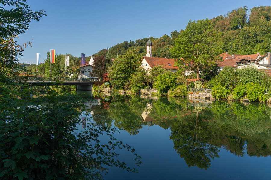
Sharpness and blur are things that exist only in images (photographs). When we go through our lives in everyday life and observe and look at our environment, there is no blurriness.
Our eyes unconsciously and rapidly glance at all the prominent parts of an image, focus sharply on each of these individual frames, hand this chaos over to the brain, and lo and behold: We have the illusion of a 100% perfectly sharp picture. Even if we have truly looked at at most 10 or 20 percent of all details, we live with the certainty: Yes, reality out there is exactly like that.
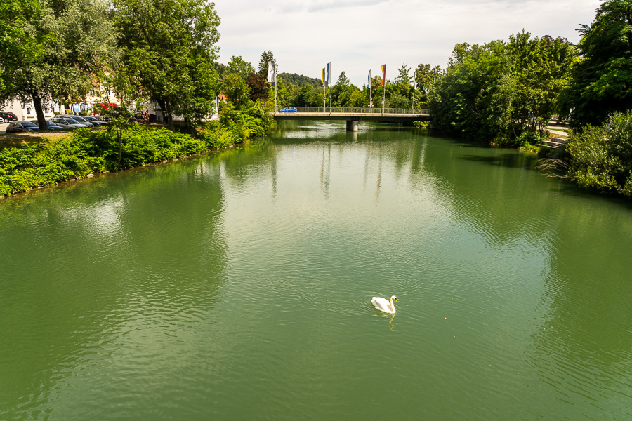
We are firmly convinced: Yes, we saw the tree, its reflection in the Loisach, the church steeple, the bridge with the flags, etc. all perfectly, we saw it sharply, and we know what's going on. However, as mentioned above, this is only an illusion:
Answer the question yourself without looking at the image above again:
How many flags are on the bridge?
How many flags are reflected in the Loisach?
What time does the church tower show?
Is it true that the reflection in the water is slightly darker?
How many clouds are in the white and blue sky?
Is the mountain forest behind the Wolfratshausen church still green, or are there already autumn-brown trees?
Current, temporary, committed
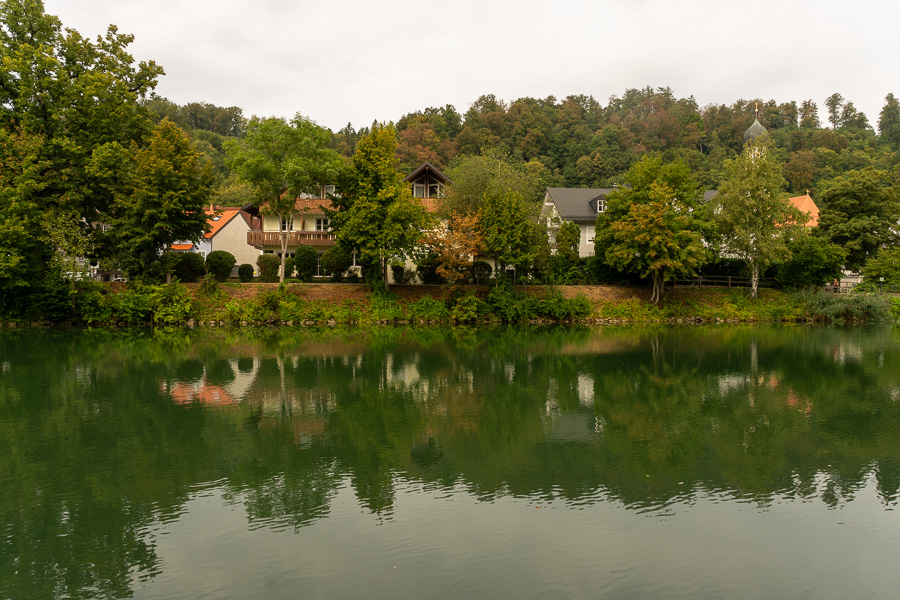
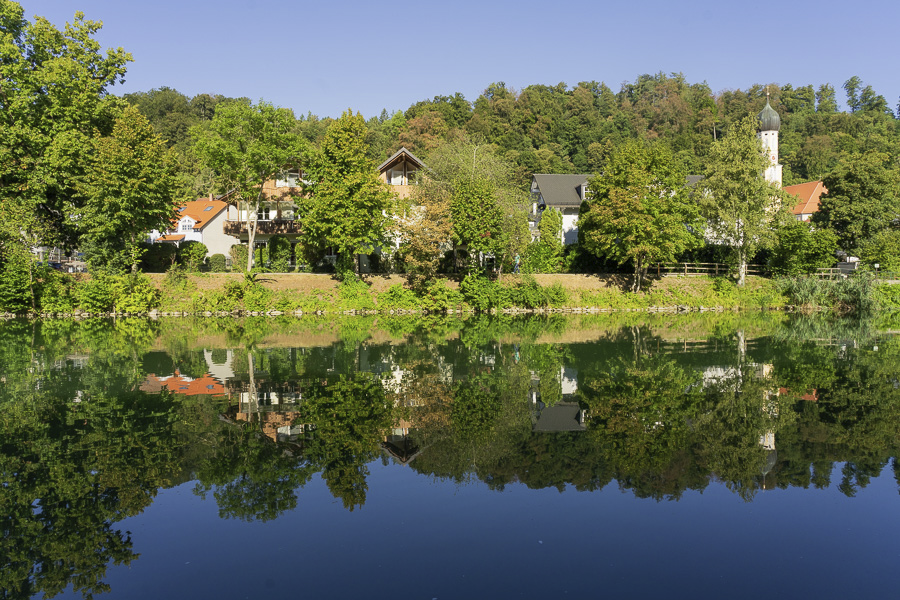
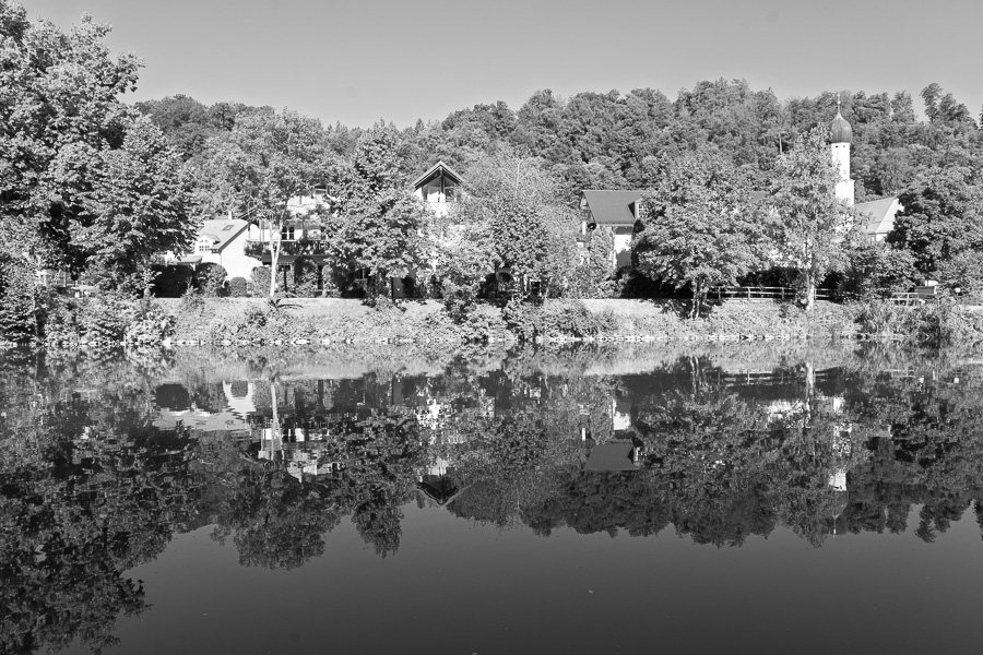
Every day something new is going on. The media is full of it. Internationally (globally), nationally, and locally too.
Just think about how many words you speak daily with acquaintances, relatives, coworkers, and club members about everyday, current topics.
And the theme of this page is: „Photographers speak with images.“ They express themselves not only with words, not only with texts (books, documents, emails) but they communicate visually with images. Even about everyday things.
You skillfully express your opinion, especially and precisely through images. That is why they call you a photographer.
As I write these lines, there is a local discussion here in Wolfratshausen as to whether the water management office is allowed to repave a tiny area of the Loisach riverbank (see picture). Beavers and „the tooth of time“ make a bank renovation necessary.
And since some trees have to be cut down, there is now a local „tempest in a teapot.“ 25 trees out of about 25,000 trees here in town (including the mountain forest) would have to be cut down.
And this is where you come in: If you want to speak out as a photographer: Join the visual conversation. Take your own personal pictures and publish them in the local press or the local Facebook group.
Consider how to visually implement your individual message: in color or black and white, with a reflection or without a reflection, with daylight or at night, with a blue sky or with rain clouds, etc.
There are NO limits to your imagination.
You certainly have your own point of view. Express it.
Visual.
With or against the current?
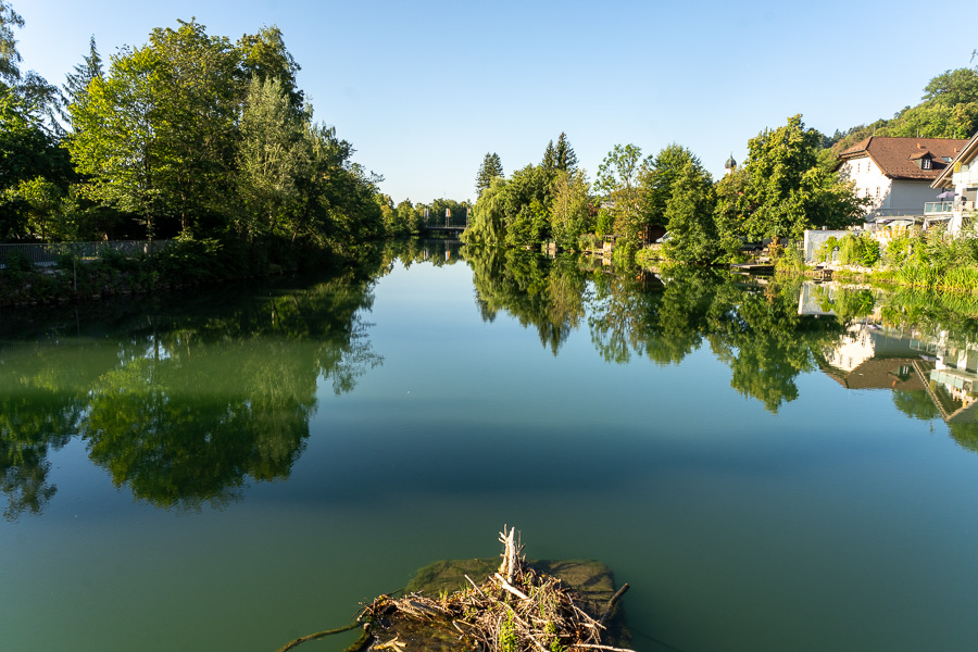
Basically, you should consider what you personally want to express. What is your personality like? Do you like to go with the flow? Do you want to be recognized and always be a good member of society, or do you occasionally have or feel the inclination to have an opinion of your own and express it?
They will know you by your pictures!!!
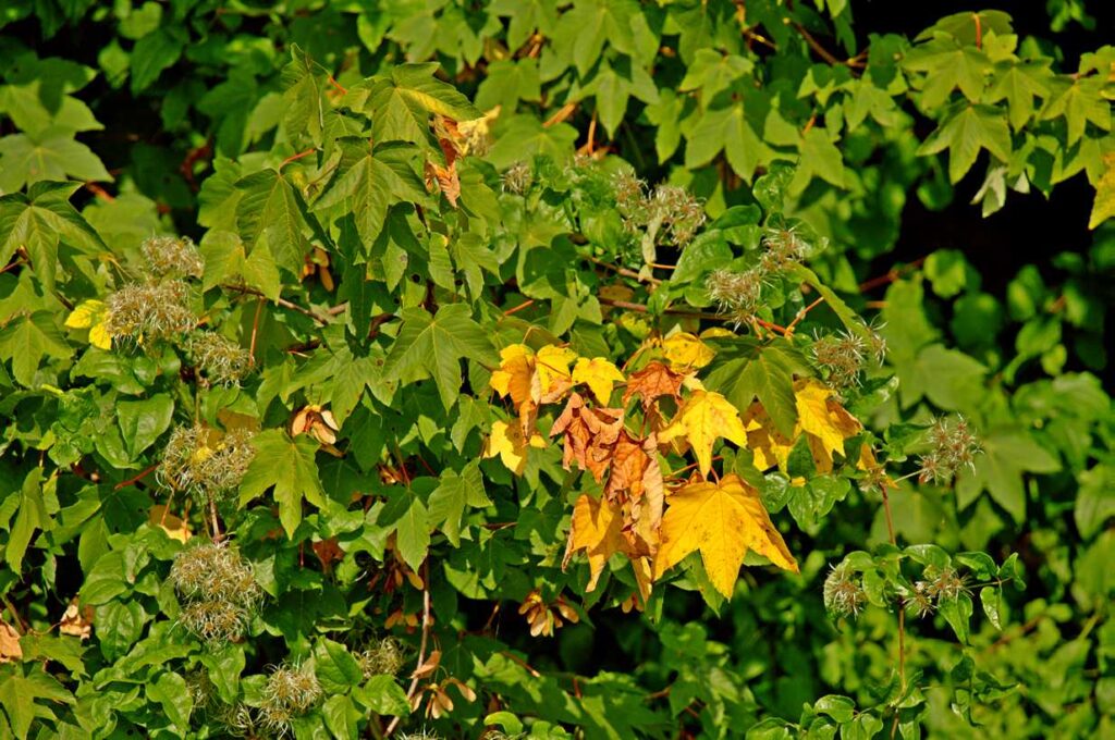
In the summer of 2026, one of the dominant topics in the media was the long drought.
How do you express yourselves visually on this? With images of drought, brown autumn leaves already in summer, or do you show the opposite? Do you swim with the mainstream or not?
I live in Wolfratshausen. That is in Upper Bavaria, right between Munich and Bad Tölz. Generally speaking, this is said to be the water-richest region in all of Germany. So anyone who lives here can express both with good reason and photographic evidence. I like the book title by Reinhard K. Sprenger: „The choice is yours!“
But be careful. Whether you swim with or against the current, with your picture post on the respective topics you show that you are interested in them. That you want to say something about it. Whether you agree or disagree, the topic occupies you. Ask yourself first: Is it worth it?
But that is only the second step. The first question would be: Are you even interested in this topic? Is it worth your time, effort, and commitment? Does this topic affect you personally? If you answer yes to these questions, then dive right in. Get involved. Let your visual voice be heard.
However, keep in mind that the time and energy your efforts cost you will be lacking for other topics. Surely you have heard of the Stoics. Their teaching says: „Focus on 100%—on the things you can influence. And accept the rest.“ And: „Don’t waste time getting upset about things you can’t change. Put your energy where it makes a difference—in yourself.“
Date Stamp
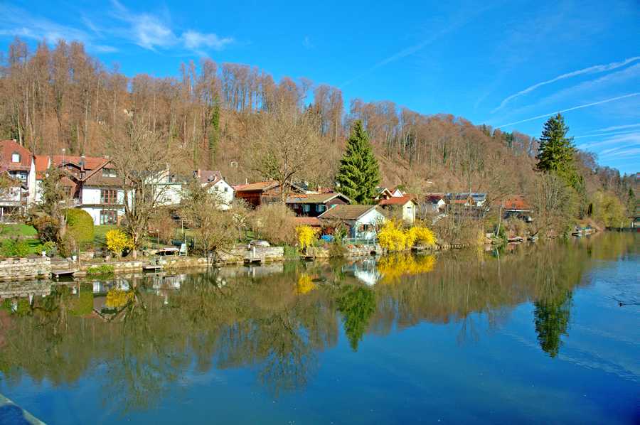
If you want the viewer of your pictures to notice in which season your pictures were taken, so if this is important for your photographic message, a (small) element should consistently point to it.
Known elements of the season include, among others, snow and ice, bare or green trees, golden rain as seen here in the picture, daffodils, brown autumn leaves, sailboats on the lake, mushrooms, flowers that bloom only at a specific time, plum sheet cake in August, ripe fruits like apples, ripe grain, farmers sowing seeds, the size of the corn plants, etc.
A cityscape of Wolfratshausen
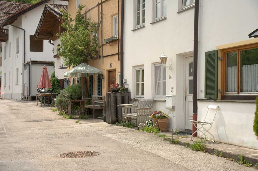
Image description: Quiet, peaceful, a bench in front of every house, a close-knit neighborhood, grass growing out of the asphalt, small houses, flowers, etc.
The message of the image becomes particularly clear to me when I consider what it is NOT.
- No urban highway directly in front of the house.
- No large crowds while shopping.
- No skyscrapers,
- No glass palaces,
- no traffic,
- no rush
New York, Tokyo, and Hong Kong look different.
Single image or series?
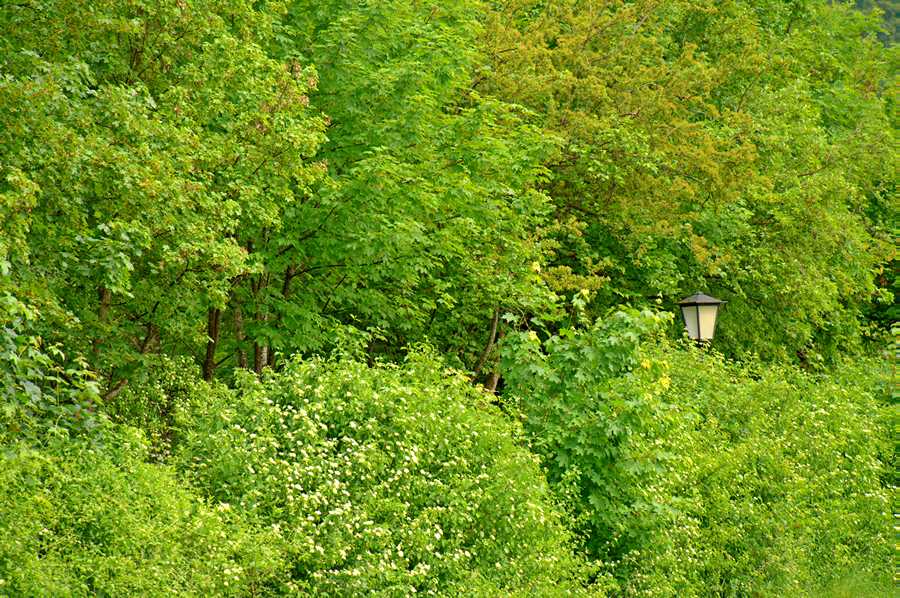
I often find that a single image isn’t enough to express myself. A single image often doesn’t say enough. Its message is too open to misinterpretation. Just as a single word or sentence alone is often not enough to articulate my thoughts clearly. When speaking (verbal communication), I use several words or sentences to express myself clearly and understandably.
In this picture, there is a lot of greenery—many leaves from trees and bushes—along with a small sign of civilization. The viewer is bound to be confused because they don’t immediately and intuitively grasp the meaning of the image. And since the image isn’t particularly spectacular, the viewer doesn’t think, “WOW, sensational, awesome, etc.,” and is content with it even without understanding it.
A second image in this series makes the message clearer, more distinct, and easier to recognize:
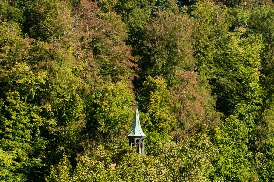
This picture has certain similarities to the first one: once again, there are a lot of leaves. Once again, there’s a lot of green. Once again, there’s a small sign of civilization. Because of the similarities, the viewer can better understand what the photographer is trying to convey.
You decide for yourself how many photos to include in a series. At some point, you’ll cross the line where the viewer has already figured out what you’re trying to say and starts to get bored.
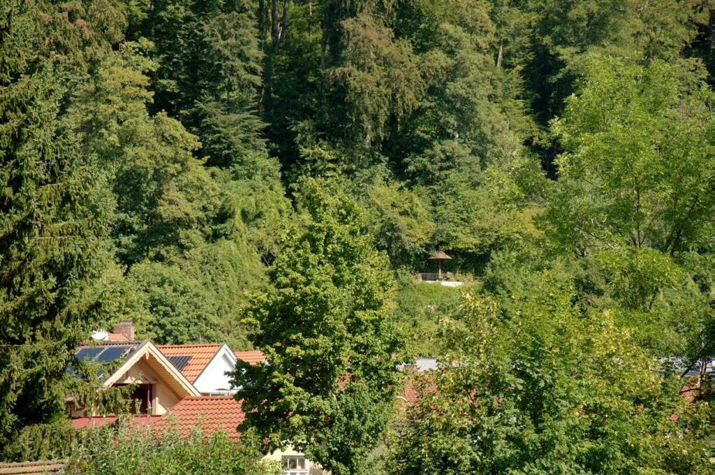
For this series, which I will also explain here in the text, I'll stick to 4 pictures. I think you have understood the principle. At some point, as a pun on my hometown „Wolfratshausen“, I had even named the headline for this series „Grünratshausen“.
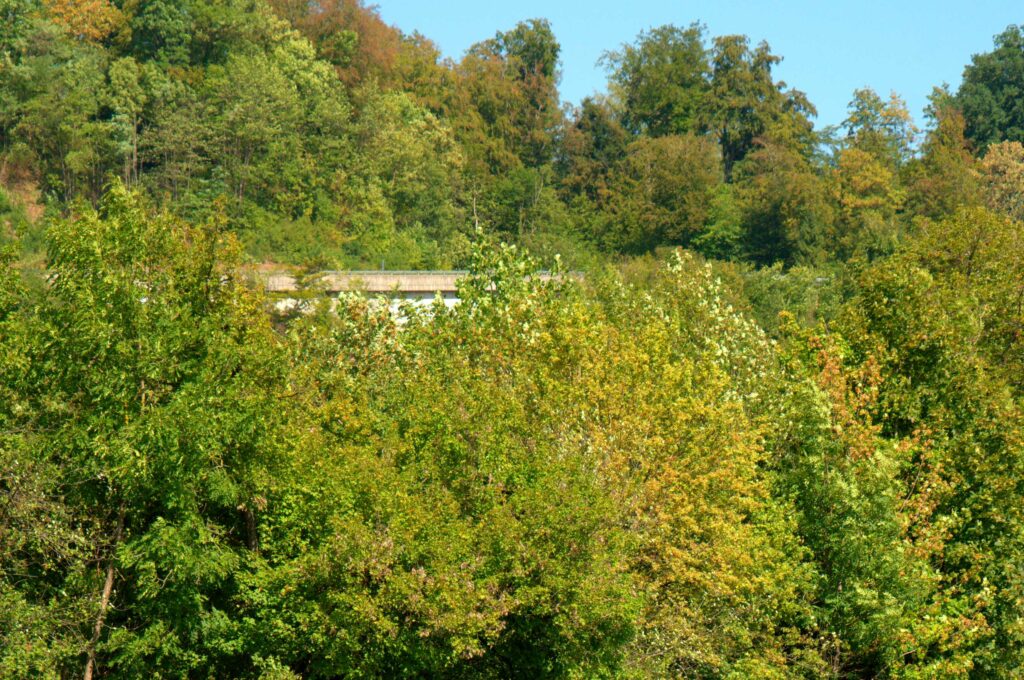
Even the entrance to Wolfratshausen can be depicted in green.
My visual impression of the city, which I want to express in this series during my daily photo walks, is that there is „quite a lot of green“ here. And what's more, „right in the middle of the city.“ The small green turret in image 2 is the top of the town hall. However, this impression is highly individual. Other residents certainly have a completely different impression of this place.
Image statement with light: blue light or gray veil
There is hardly a single photography textbook that doesn't include the pun: Photography is drawing with light was particularly emphasized. Photo is derived from the Greek word phos (Genitive: photos) which means light (photons are particles of light). Spelling comes from graphein, which means to write, draw, or depict.
So, combined, it literally means „drawing or writing with light.“.
a crucial statement, or as I have read: We are lifelong hunters of the light.
Two examples should illustrate this: The same subject, a boring street scene here in Wolfratshausen. Once with a blue sky and once with an overcast sky.
And to make that clearer, I removed the sky above the rooftops.
Wolfratshausen with a gray haze
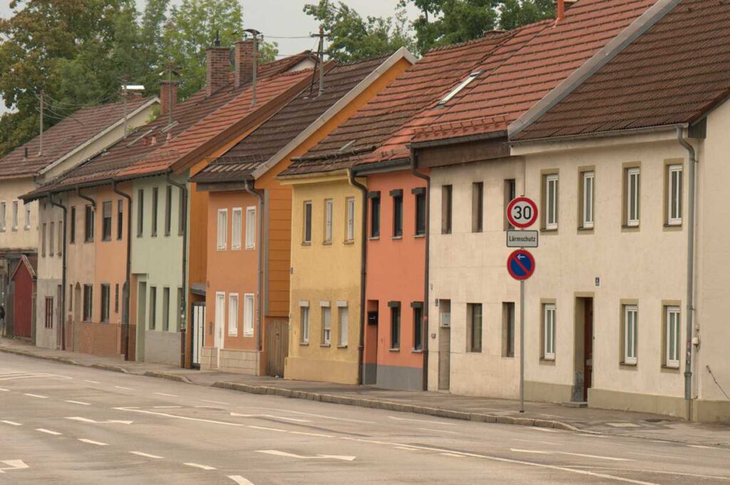
The picture in the sunshine
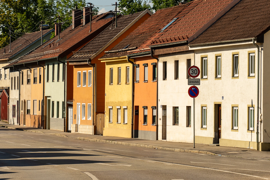
Note: As with ALL of my pictures here, the note applies: You photograph people, cities, vacation pictures, landscape shots, etc. You photograph „real life.“ All elements listed here in the encyclopedia are just accessories for you. And yet, when looking at the display or through the viewfinder, you should always think of these basic elements of visual language so that your pictures become more expressive. Wedding pictures with an overcast sky are gray and therefore problematic.
Grey or Blue in Venice
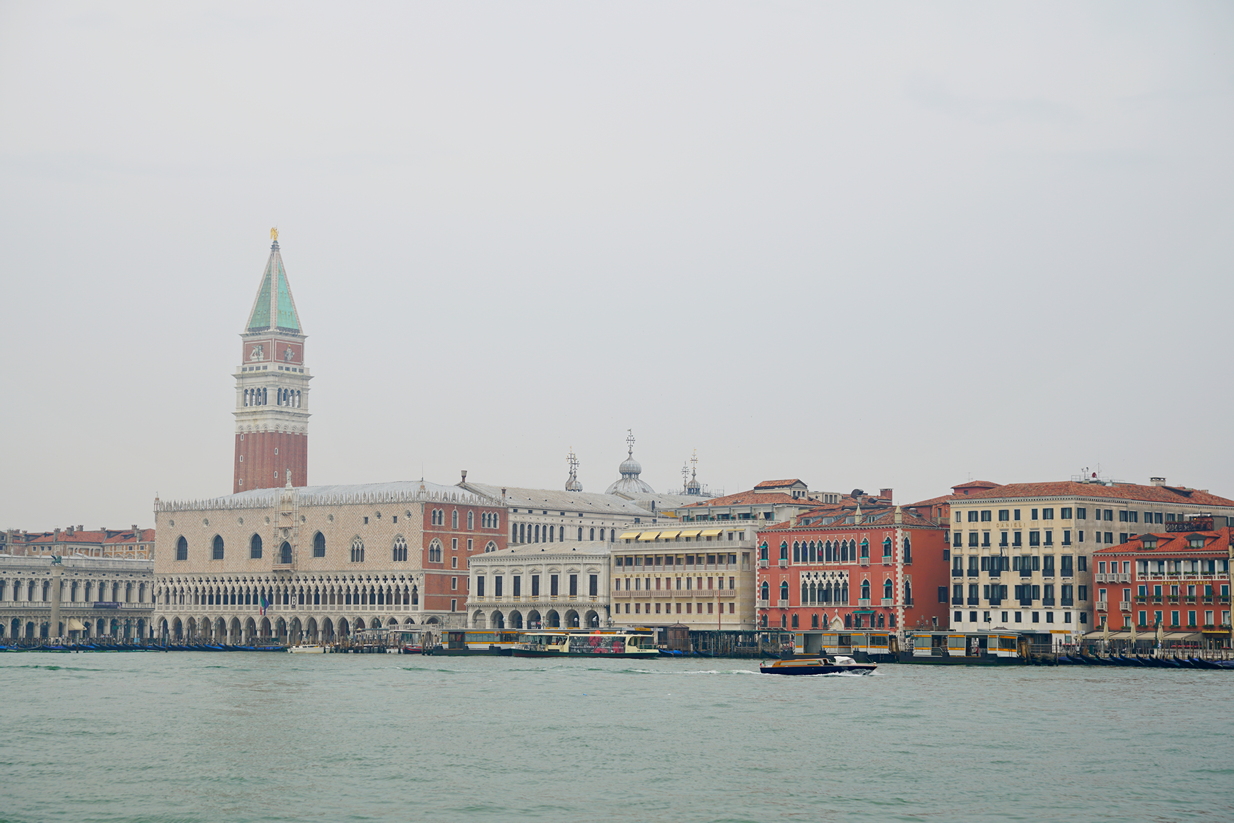
I often have to travel to Venice for work. And the weather there isn't always 100% perfect either. Pictures like these are counterproductive. Anyone who's in Venice for just one day—on a day like this—will take some souvenir photos, but you can't really show them off.
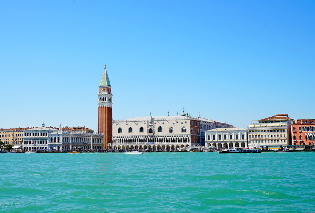
This image is more suitable for the city's tourism board.
Local statements always work!
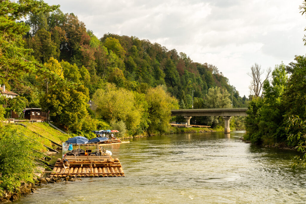
Motives that always work: Local relevance. Tell others with your pictures that the raft season is beginning here in Wolfratshausen today. Or that it is ending today, and that the last raft for this year is floating down the Loisach to Munich. Or that today the football club FC Bayern Munich is traditionally taking its annual club outing, etc.
And if you are really interested in the topic, create a small photo series about where the tree trunks come from and what happens to the trunks at the end of the season. Document the story behind it and create a small photo series with very few words (AI will gladly and freely help you with the wording). The operator of the raft trips will surely be happy to help you. After all, it is free advertising for him. And presumably he cannot take pictures as well as you can. This series of pictures is popular with the local press or the local Facebook group. And it helps you enormously to become known as a photographer.
1 of 5
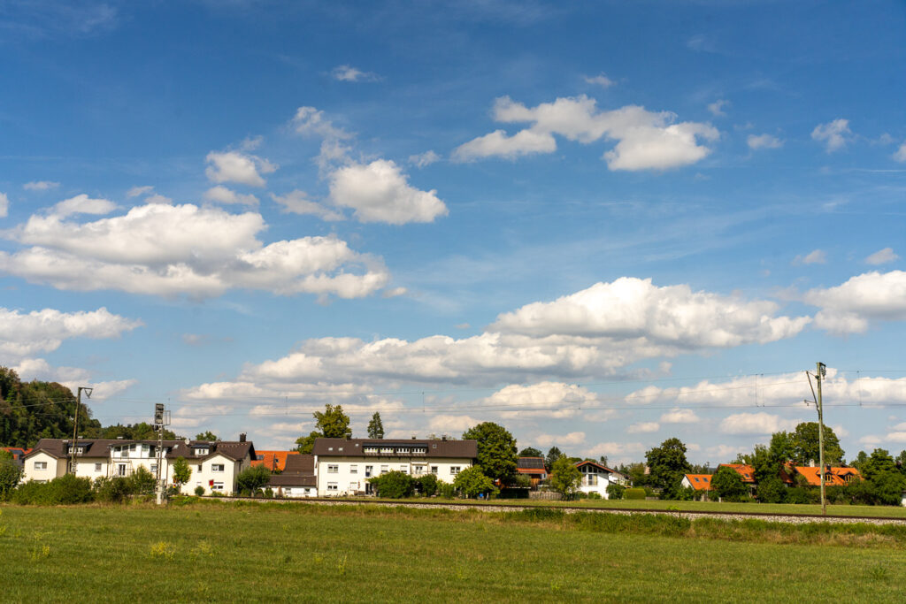
Photographic message is always personal and highly individual, and it is an art to execute this message with such technical skill that the viewer can understand and empathize with it.
If I were only allowed to show five pictures of Wolfratshausen, this picture would definitely be one of those five. Why? To me, it expresses a quiet, rather village-like character. Good weather, the typical white and blue Bavarian sky. The houses are rather small. Reddish-brown tiled roofs. No tall glass palaces. No urban highways. Lots of greenery. And a railway track is visible.
And as is so often the case, an image can also be ambiguous:
- Quiet or boring.
- Tranquil or „dead as a doornail“.
- Village-like or „there's really nothing going on here“
I see I And to put it this way: Wolfratshausen is a rural small town. For me, it is important that the S-Bahn is here. With it, I commuted to Munich for work for 40 years. Since I worked in IT, there was a much wider selection of interesting jobs in Munich. So for me, the S-Bahn is an important part of Wolfratshausen.
Otherwise, the blue sky expresses the fine weather. Green meadows instead of an artificially maintained city park. For me and in my life, Wolfratshausen is a quiet, tranquil place to live in the commuter belt of Munich.
Everything you express verbally (communicate) is also personal and individual. Every listener will recognize that the words come directly from you.
All the texts you write (communicate) come from you; they are your literary expression. These can even be read by several people, even if they don't know you personally.
And the pictures they take are, of course, also personal and individual. These pictures of yours correspond to your individual visual statement, attitude towards life, interpretation, and opinion. The viewer should and must notice that.
And nobody has the right to criticize or praise your personal opinion, which you express in your pictures. On the relationship level, all people are equal in value. It may be that a viewer thinks you did not execute your statement with optimal craftsmanship. That is then an expression of opinion on the factual level. That can be talked about, discussed, and you can only learn and mature from it.
To judge a picture without knowing the message is extremely stupid, perverse, and shows the idiotic arrogance and narrow-mindedness of those who do so. My opinion: Beware of photo contests or photo competitions. Too many mediocre or even bad photographers try to elevate themselves above others by judging their pictures. The juror thinks he is in a lofty position, and he seeks and enjoys this. If you notice a photography contest, do not walk away, run away!